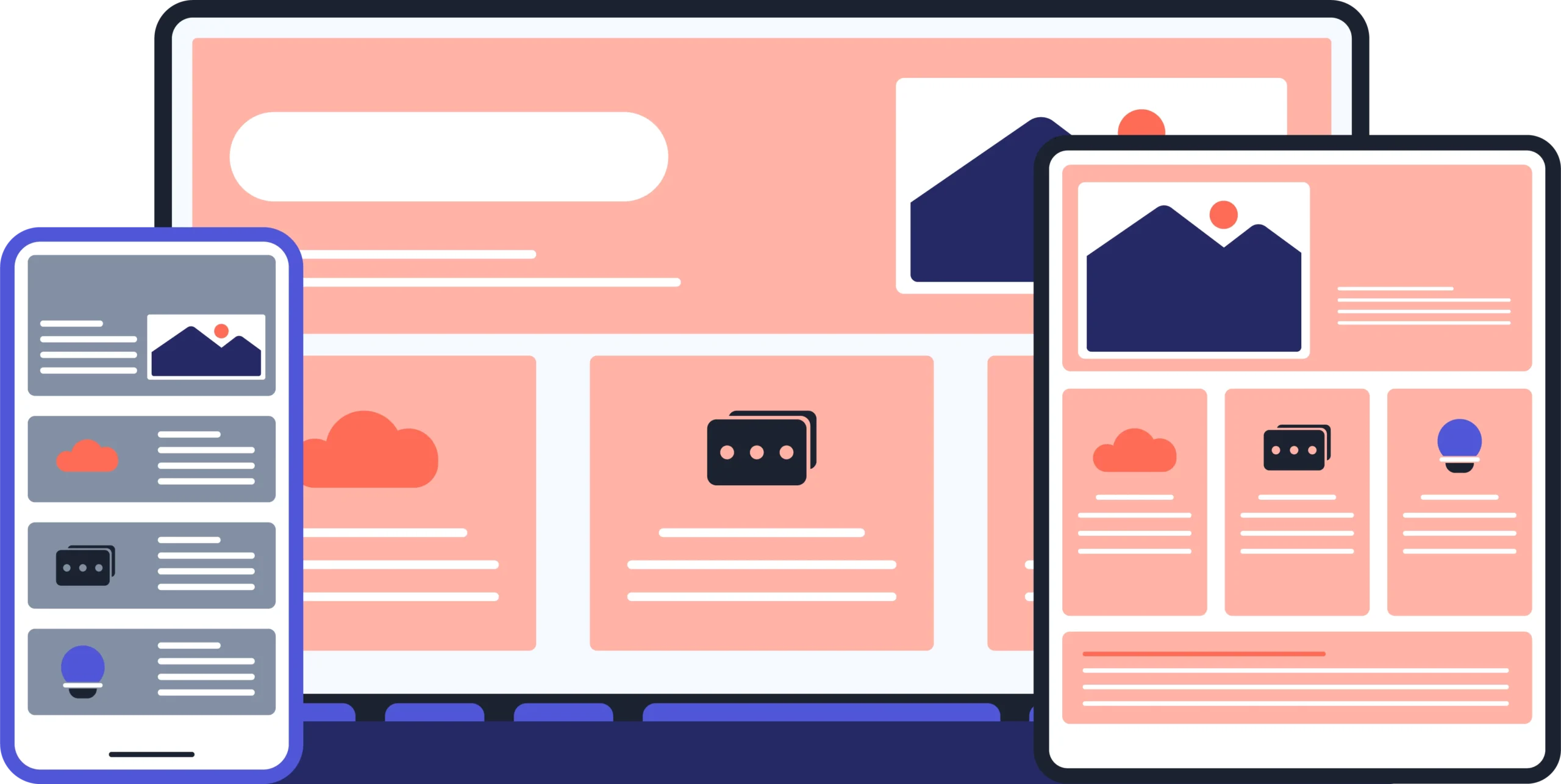
Reliable Responsive Web Design Services
Crafting reliable responsive web Design Services deliver stunning, user-friendly websites that adapt perfectly to any device. Experience fast loading, mobile-optimized layouts, and SEO-friendly designs crafted to enhance engagement, usability, and your online presence.
Trusted partner for startups and Fortune 500 companies.


Professional Responsive Web Design Services
We provide reliable responsive web design services tailored to ensure your website adapts seamlessly across all devices. Our expert team creates fast, mobile-optimized, and SEO-friendly websites that deliver exceptional user experiences, improve engagement, and enhance your brand’s online presence with easy maintenance and top performance.
Custom Responsive Website Design
Custom responsive website design creates tailored sites that adapt flawlessly to all screen sizes. It ensures consistent branding, enhances user engagement, boosts SEO, and provides a seamless, fast-loading experience across devices.
Mobile-First Web Development
Mobile-first web development prioritizes designing for smartphones and tablets before desktops, ensuring fast loading, easy navigation, and enhanced user experience. This approach improves SEO rankings and meets the growing mobile user demand effectively.
Responsive Website Redesign
Upgrade your existing website with our responsive redesign services that improve navigation, readability, and interactivity. We ensure your site looks great and works flawlessly on all devices, enhancing user experience and boosting SEO performance.
Cross-Browser and Device Testing
We perform comprehensive cross-browser and device testing to ensure your website functions flawlessly and looks consistent across all browsers and devices. This guarantees a seamless user experience, improved accessibility, and broad compatibility.
100s of companies worldwide trust us for their Web designs.
Our web designing rating
Excellent
4.5
Key Facts About Responsive Website Redesign
Responsive web design dramatically enhances user experience by allowing websites to adapt seamlessly to various screen sizes and devices. This ensures content is easily readable, navigation is smooth, and interactions are intuitive whether on desktop, tablet, or mobile. By using flexible grids, adaptive images, and CSS media queries, responsive sites prevent distortion and minimize excessive scrolling, keeping users engaged. Enhanced usability reduces bounce rates, boosts customer satisfaction, and supports higher conversion rates, making it essential for modern web success.
Consistent branding across devices is crucial for building trust and recognition with your audience. Responsive web design ensures your logos, colors, fonts, and messaging remain uniform whether users visit via desktop, tablet, or smartphone. This seamless brand experience strengthens your identity, aids consumer recall, and promotes loyalty. Leading brands like Nike and IKEA maintain visual consistency to enhance user confidence and deliver a professional image on every platform. Achieving responsive branding means your website not only adapts functionally but also visually, providing a cohesive, polished presence everywhere.
Responsive website redesign significantly boosts conversion rates by enhancing user engagement. Studies show responsive sites achieve 11% higher conversions compared to non-responsive ones. Mobile users engage 15% more on responsive platforms, resulting in longer sessions and more unique clicks. Fast-loading, visually appealing, and easy-to-navigate designs reduce bounce rates and build user trust, helping convert visitors into loyal customers while improving SEO performance and overall business growth.
Researching and gathering inspiration from top responsive websites is essential for crafting a modern, user-friendly design. Leading examples showcase fluid grids, flexible images, and adaptable layouts that ensure seamless performance across devices. These sites focus on clear navigation, scalable typography, and optimized media for faster loading and accessibility. Drawing ideas from industry leaders helps create innovative web designs that engage users, improve SEO, and future-proof your online presence.
Ensuring images and media scale correctly on all screen sizes is vital for responsive web design. This is achieved by using flexible CSS properties like max-width set to 100% and height set to auto, which allow images to resize dynamically without distortion. Additionally, employing HTML attributes such as src set and sizes serves appropriately sized images based on device resolution, saving bandwidth and improving load times. Responsive images maintain aspect ratios and enhance user experience by adapting seamlessly to different devices, from mobile phones to large desktops, ensuring fast, visually appealing, and accessible content. Moreover, techniques like lazy loading and optimized formats (WebP, AVIF) further enhance performance, making flexible media a cornerstone of modern, efficient, and user-friendly websites.
Our Technology Stacks


Why Choose Zenerom for Your Responsive Web Design?

Crafted for Every Screen
To start with Zenerom ,Web design company in Dubai , the process typically involves understanding your business requirements and goals to tailor digital marketing, web design, or app development solutions accordingly. Zenerom specializes in creating customized, high-quality responsive websites, SEO services, digital marketing strategies, and mobile app development. They also handle domain registration, web hosting, and website maintenance to ensure a seamless online presence. Based in Kerala and Dubai, Zenerom offers competitive pricing with 24/7 support to help businesses scale
Trusted Responsive Web Experts
At Zenerom, our team of trusted responsive web experts brings unmatched experience in crafting websites that seamlessly adapt to any device. We leverage advanced techniques like fluid grids, flexible images, and CSS media queries to deliver fast, visually appealing, and accessible websites. Our focus is on optimizing performance, enhancing user experience, and ensuring your online presence is strong and future-proof.
Seamless User Experience
A seamless user experience is vital for responsive web design, ensuring your website works flawlessly on all devices. It provides easy navigation, readable content, and smooth interaction on smartphones, tablets, and desktops. Responsive layouts eliminate zooming or horizontal scrolling, while fluid images automatically adjust to different screen sizes, maintaining clarity without distortion. Fast loading and a clear visual hierarchy keep visitors engaged. Consistent and pleasant experiences build trust and encourage deeper exploration, boosting conversions and satisfaction. Focusing on seamless UX delivers accessibility, efficiency, and aesthetic appeal that connects your brand meaningfully with users everywhere.
Quality Responsive Solutions
Zenerom delivers quality responsive solutions designed to provide flawless website experiences across all devices. Our team employs advanced techniques such as flexible grids, scalable images, and media queries to ensure your site adapts perfectly to different screen sizes. These solutions enhance site speed, boost SEO, and improve user engagement. We craft websites that are visually appealing, easy to navigate, and future-proof, making your digital presence strong and adaptive in an ever-changing online landscape. Partner with us for innovative, reliable, and scalable responsive web design.
CASE STUDY
Zenerom redesigned a professional services website to boost user engagement and SEO. The team developed a responsive, fast-loading site with easy navigation. Post-launch, organic traffic rose 30%, and client inquiries increased by 25% within three months, proving Zenerom’s ability to create impactful, business-driven web solutions.
WordPress
Shopify
Responsive Design Process- Clear, Adaptive, and User-Centered
Our responsive design process focuses on creating websites that adapt seamlessly to any device. We follow a clear, step-by-step approach to ensure every design is user-centered, functional, and visually engaging.
STEP 1
Design & Develop
Design & Develop involves creating intuitive, visually appealing layouts and turning them into fully functional websites. This phase includes converting design assets into code using technologies like HTML, CSS, and JavaScript, ensuring responsive, fast-loading, and SEO-optimized sites tailored for an optimal user experience.
STEP 2
Test & Launch
Thorough testing ensures your website works flawlessly across devices and browsers. After fixing issues, the site is launched live with monitoring for any post-launch bugs. This careful process guarantees a smooth rollout, optimal performance, and a positive visitor experience from day one.
STEP 3
Maintenance & Support
Maintenance & Support ensures your website stays secure, fast, and up-to-date. Regular updates, security checks, backups, and performance monitoring prevent downtime and issues. Ongoing support helps fix problems quickly, keeping your site running smoothly and delivering a great user experience consistently.
Frequently Asked Questions (FAQ)
What is responsive web design?
Responsive web design is an approach to creating websites that automatically adapt to any device or screen size, providing an optimal viewing experience. It uses flexible layouts, images, and CSS media queries to resize, rearrange, and display content in a user-friendly manner. This design method ensures easy navigation, readability, and usability across desktops, tablets, and smartphones, eliminating the need for separate mobile sites while boosting SEO and user satisfaction.
Why is responsive design important?
Dynamic adaptation of website elements allows responsive design to enhance accessibility and reduce bounce rates. It enhances user engagement, reduces bounce rates, and improves SEO rankings by being mobile-friendly. Managing a single responsive site saves time and costs compared to multiple versions. Additionally, faster load times and future-proof flexibility help keep your website competitive and accessible as devices evolve.
How does responsive design impact SEO?
Expert design transforms businesses by delivering visually stunning, highly functional websites that drive measurable results. This approach combines the newest technologies with creativity to build responsive, SEO-optimized sites that engage users and load quickly. Focused on strategy and user experience, these designs convert visitors into loyal customers, enhancing brand credibility and maximizing ROI. Such professional web design provides sustainable online growth and a competitive advantage in today’s digital landscape.
How long does a responsive web design project take?
A typical responsive web design project usually takes about 6-10 weeks from start to launch. This timeline includes phases like discovery and planning, design and development, and thorough testing. The exact duration depends on the website’s complexity, content readiness, and the time allocated for client feedback and revisions.
Can existing websites be made responsive?
Yes, existing websites can be made responsive through redesign or updates. By analyzing the current layout, adding CSS media queries, optimizing images, and adopting flexible grids, non-responsive sites become adaptable to all devices, enhancing user experience across mobile, tablet, and desktop screens.
SIMILAR TECHNOLOGIES
Concentrate your core business and get more with Zenerom’s expert outsourcing solutions.
Zenerom

Book A Time With Zenerom
Let’s innovate together—book your slot today!
Zenerom Dubai
Excellent
Software Development Agency Dubai
4+
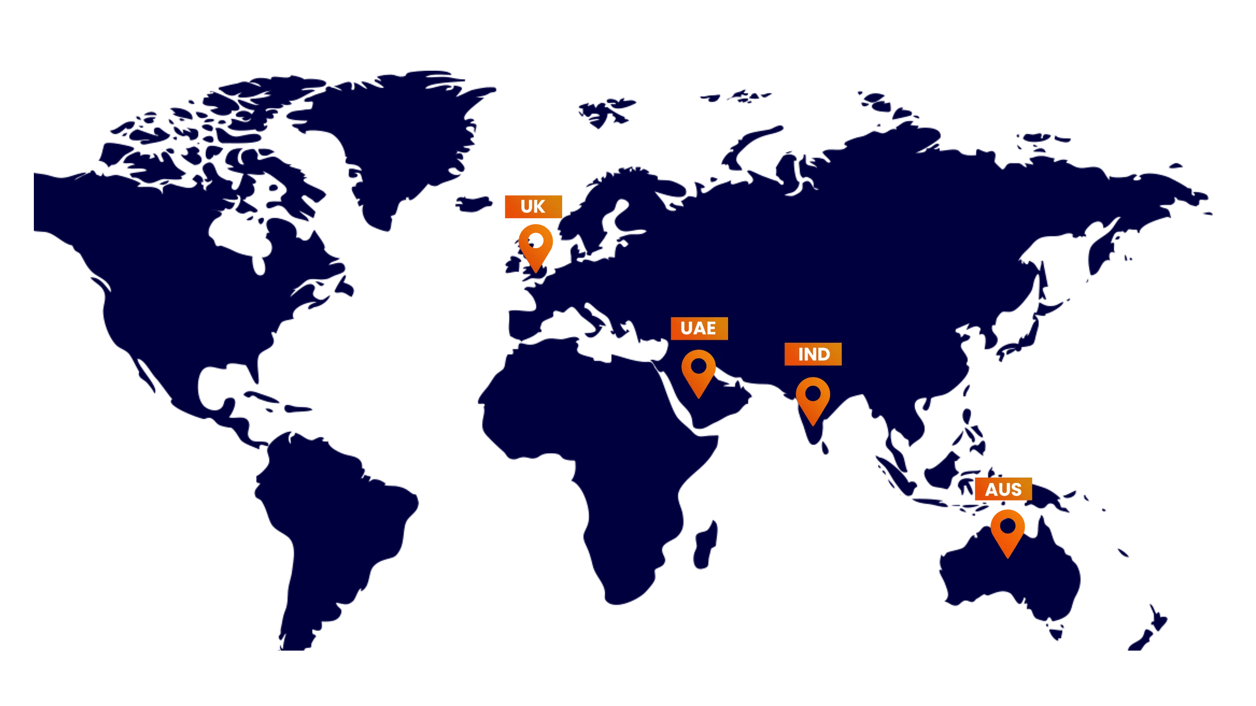
LOCATION BRANCHES
UK
62 Macgill Dr, Edinburgh EH4 4FB, United Kingdom
info@zenerom.co.uk |
+44 774 218 0970 | Website
INDIA
2nd Floor, Khadeeja Building Annie Thayyil, Lane, Xavier Arakkal Rd, Kochi, Kerala 682018
info@zenerom.com | +91 7012055516 | Website
AUSTRALIA
81 Flushcombe Rd, Blacktown NSW 2148, Australia
info@zenerom.com.au | +61 433 838 577 | Website